


TL;DR
- Component-First CSS and its limitations
- Utility First CSS
- TailwindCSS
- How to get started with it
Component-First CSS
CSS as we know(Component-First) is awesome, just add classes to HTML elements and in the CSS file add styles to those classes, and Voilà! your page looks beautiful now✨
Component-First CSS tells us what the element is

Writing Vanilla CSS is all fun and games but as soon as you move onto large and complicated apps you start facing a lot of issues like
- Naming Inconsistency
- Code Repetition
- Limited Reusability
And there are solutions to tackle those problems, for example
- BEM Naming convention,
- Component Libraries like Bootstrap
- Utility-First CSS
All these come with their own Pros and Cons and the best one is the one that aligns better with your problem or use case
Utility-First CSS
Let's see how the Utility-first approach helps us tackle all those problems,
Here are some of the characteristics of it
- Atomic utility classes
- Custom Design
- Saves years of work of the most difficult task in programming "Naming" Classes :')
Atomic classes mean every class contains only one style and hence rather than telling what the element is
Utility-First Classes tells us what the elements look like
Also as we don't have any predefined components the design turns out to be unique, which is not the case in bootstrap as many people use the default components, which in turn results in a similar feel of design everywhere.
Aaaaand the best part no head-scratching while naming those kilometer-long classes

TailwindCSS
A utility first CSS Frameowrk
Tailwind is basically a hugeeee collection of atomic utility classes, which turns out custom designs And the best and the worst part is iniline-styles, good thing is you don't have to maintain separate CSS files but it makes the HTML file so verbose
<div className="fixed z-10 h-24 w-full flex items-center justify-between py-4 px-20 text-xl">
      <div className="h-16 w-16 transform hover:-rotate-360 transition duration-500 ease-in-out">
          <img src={logo} alt="logo" />
      </div>
      <div className="flex justify-around items-center space-x-4 text-light-gray font-mono">
            <h2 className="cursor-pointer hover:text-bright-green transition-all duration-500 ease-in-out">
                <span className="text-bright-green">01.</span> Home
            </h2>
            <h2 className="cursor-pointer hover:text-bright-green transition-all duration-500 ease-in-out">
                <span className="text-bright-green">02.</span> About
            </h2>
        </div>
</div>
I know you didn't even bother to read the code snippet that's what I was talking about the verbose HTML.
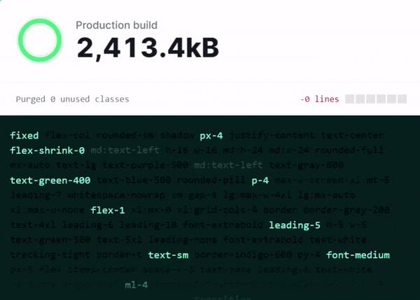
Now the question arises what about the CSS size in the production build, as there so many classes but we use only a handful of those,
Tailwind uses PurgeCSS behind the curtains which scan and dumps all the unused classes which results in much smaller builds.
Conclusion
Utility-First approach looks a little intimidating at first but once you get the hang of it, there's no going back, it really speeds up the design and we are going to see it in the next part of this 2 part series